Product: IVD Platform
Cutting Specimen Processing Errors in Clinical Laboratories
Designing for environments where clarity isn’t aesthetic. It’s clinical.
Imagine if a single mislabeled tube could ripple through an entire hospital.
Not because someone was careless. Because the systems around them weren’t built for the volume, the interruptions, or the complexity of modern diagnostics.
Labs don’t fail because people fail. Labs fail because workflows do.
This platform was designed to change that.
Siloed Data. Manual Reconciliation. Preventable Errors.
Lab technicians were reconciling siloed instrument and specimen data manually. A workflow that increased cognitive load, introduced preventable errors, and slowed diagnostic turnaround. Diagnostic testing influences 70% of healthcare decisions, so the cost of ambiguity was high.
What made this hard to solve
- Five distinct user roles with different tools, mental models, and failure points
- Time-critical operations where alert fatigue is a patient safety issue
- No mobile. Shared workstations only across all lab roles
- Class C SaMD constraints and HIPAA compliance requirements at every layer
Four Roles. One Diagnostic Lifecycle.
Each role had different tools, mental models, and failure points. Mapping the workflow end-to-end helped us identify where errors originated, where information broke down, and where the system needed to intervene.
(Direct hands-on users of the IVD portal)
(Roles who shape requirements, constraints, and success but do not use the portal)
Once we mapped the ideal workflow, we layered in real-world failure modes from research: instrument downtime, reagent tracking gaps, missing notifications, and LIS upload failures. This exposed the operational fragility labs deal with daily.
Instead of designing a linear flow, we designed for resilience. Ensuring the system supported real-world interruptions, not idealized workflows.
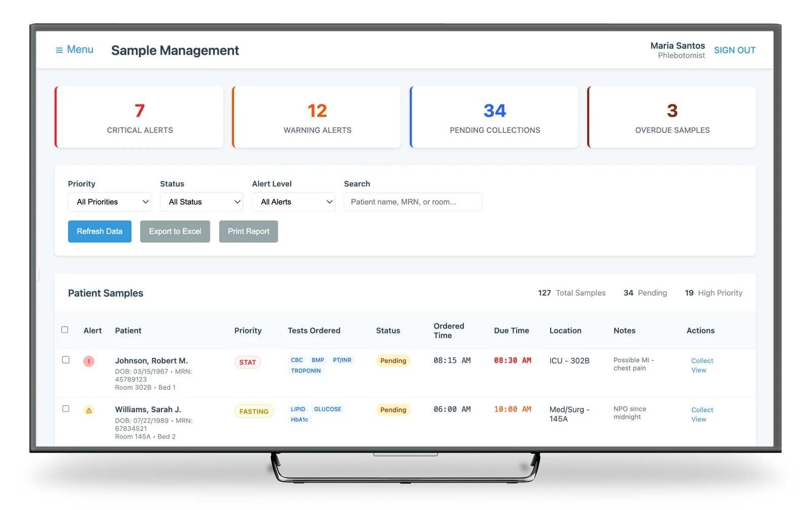
High-Volume Sample Triage
A triage model that surfaces priority, status, and next actions at a glance. Reducing cognitive load for technicians managing hundreds of samples a day using color, iconography, and grouping.
The goal: help techs immediately identify what needs attention, what is ready for approval, and what is already transmitted. Without drilling into multiple screens.
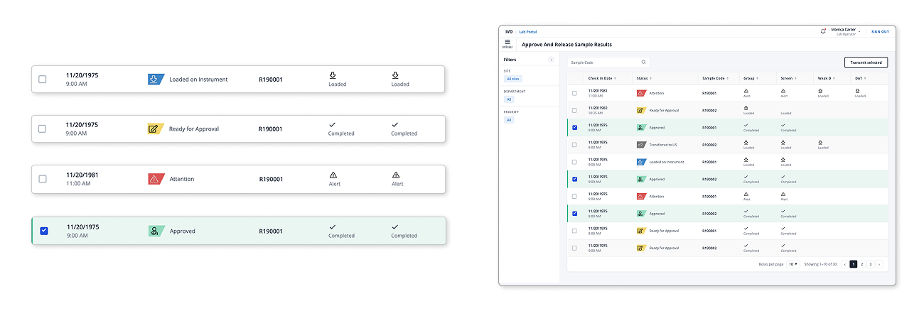
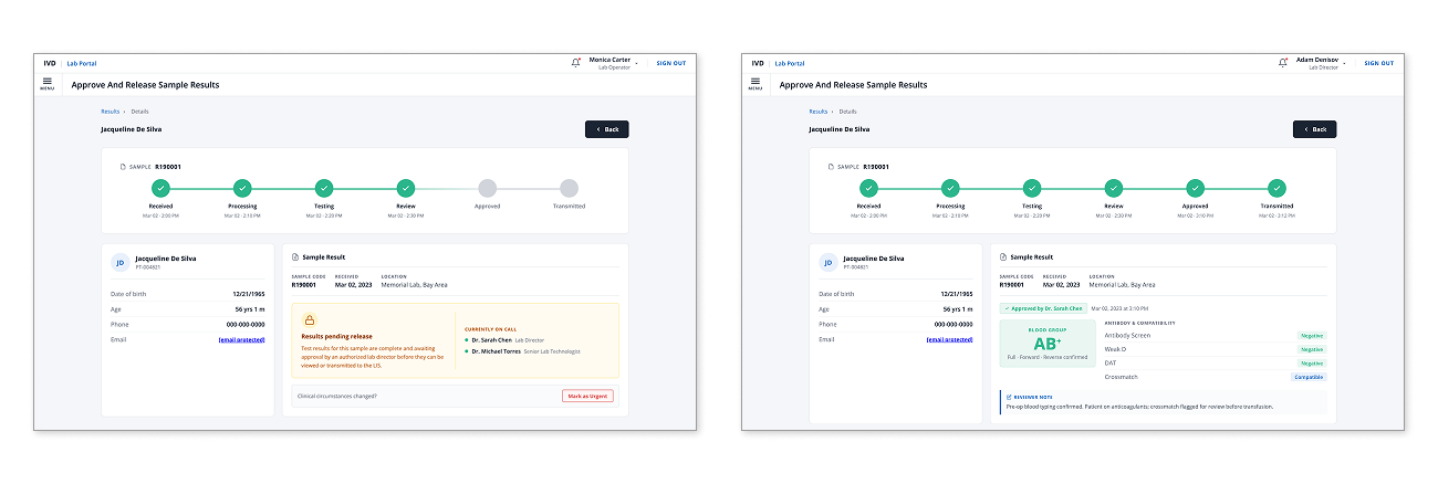
Sample Lifecycle Tracking
A single source of truth for each specimen. The progress bar replaced multiple disconnected LIS screens, giving lab staff immediate clarity on where each sample is in the process: received, processing, testing, review, approved, transmitted.
We also surfaced who is on call, what is pending release, and any urgent flags. Reviewer notes and compatibility flags appear directly in context, so decisions can be made without switching systems.
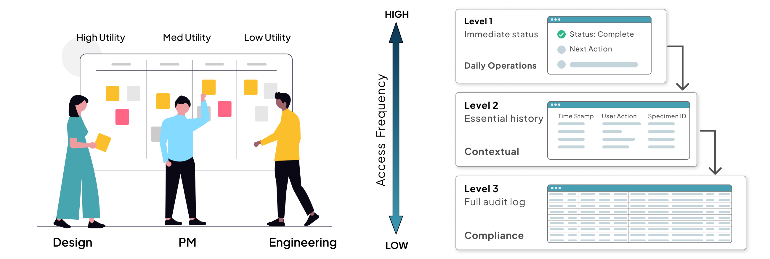
The Power of Progressive Disclosure
The ChallengeDuring the specimen tracking phase, we hit a three-way tug-of-war. Product required a highly detailed audit log for every user action to meet strict regulatory standards. Engineering was concerned that the performance overhead of constant data fetching would lag on local lab hardware. And I was concerned about the Lab Techs in a fast-moving lab, they need to get in, view tracking, and move on. Bombarding them with audit data would create visual noise and lead to manual errors.
I facilitated a quick Data Hierarchy Session where we categorized every data point by its access frequency. We realized that while 100% of the data was necessary for compliance, only 20% was necessary for daily operations.
I proposed a Progressive Disclosure Framework built on three levels:
- Level 1: Surface. Only the immediate status and next action. The get in, get out view.
- Level 2: One click. Essential tracking history. The what happened view.
- Level 3: Two clicks. The full, raw audit log for compliance officers. The deep dive view.
By moving the heavy logs a layer below, no one had to compromise. Product got their audit trail. Engineering maintained lightweight UI performance. Lab Techs gained a simplified workflow that let them process samples faster with fewer distractions. It proved that in MedTech, simplicity is not just an aesthetic choice. It is a safety and performance requirement.
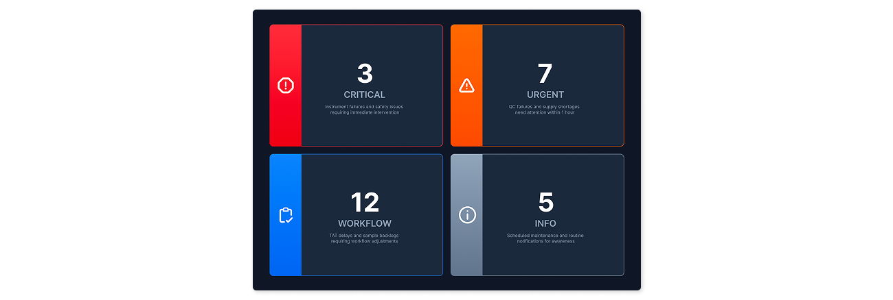
Distance-Viewable Alerts
A dashboard designed for large monitors across the lab. Alerts organized by severity and type using color and iconography for instant recognition. Lab managers can triage issues without opening detailed screens.
A shift from reactive troubleshooting to proactive operational awareness. Cognitive overload here isn’t just frustrating. It is dangerous.
Business impact
- The alert system was used as a key differentiator to win multiple enterprise contracts
Buildable, Not Hypothetical
We built real, testable components early: instrument health cards, sample check-in forms, lifecycle modules. Each piece was designed to be buildable, not hypothetical. That approach gave engineering confidence and let us parallelize design and development in a regulated environment.
Operational Accelerators
To move quickly without compromising rigor, I introduced three practices that reduced friction across the full cross-functional team.
JIRA-Aligned Design Workflows
- Transparency across design and engineering
- Alignment on sprint priorities before dev starts
- Design stayed 1–2 sprints ahead of build
Design Decision Log
- Reduced back-and-forth with PMs and engineers
- Shared clarity on rationale, not just outcomes
- Institutional memory as the team scaled
Async Collaboration Practices
- Unblocked teams across time zones
- Fewer synchronous reviews, faster approvals
- Decisions captured in context, not lost in chat
These created the conditions for the speed and rigor reflected in the outcomes below.
If I Were Starting Today
SME alignment isn’t knowledge transfer. It’s consensus-building between legacy experience and present-day operations.
Design Governance Board
A lightweight governance model to align decisions and prevent one-off redesigns before they reach engineering.
Design System as Contract
Enforce the design system as the default standard with clear onboarding and acceptance criteria from day one.
Rapid In-Context Validation
Quick, role-specific tests with real users to catch friction before handoff, not after build.
Results
Impact
We cut review cycles by 75%, shipped an MVP in six months, and launched at AACC, the industry’s largest clinical chemistry conference. The design system built for this platform went on to serve all company products.